Poster
Vignelli Letterforms
Knoll International · 1967
- Agency
- Unimark International
Analysis
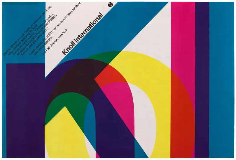
Large transparent letters overlap across a blue field. The furniture brand uses typography to show a clear interest in modern design.
“Knoll International”
Typography as imageColor overlapScale contrast
Why it worked
The letters make the brand name the main visual material. Their precise arrangement connects the manufacturer with design rather than one piece of furniture.
Lesson
Let the treatment of the brand name express the product’s design values.
Image source
© Knoll International. Shown for study and commentary.
Not affiliated with or endorsed by Knoll International.