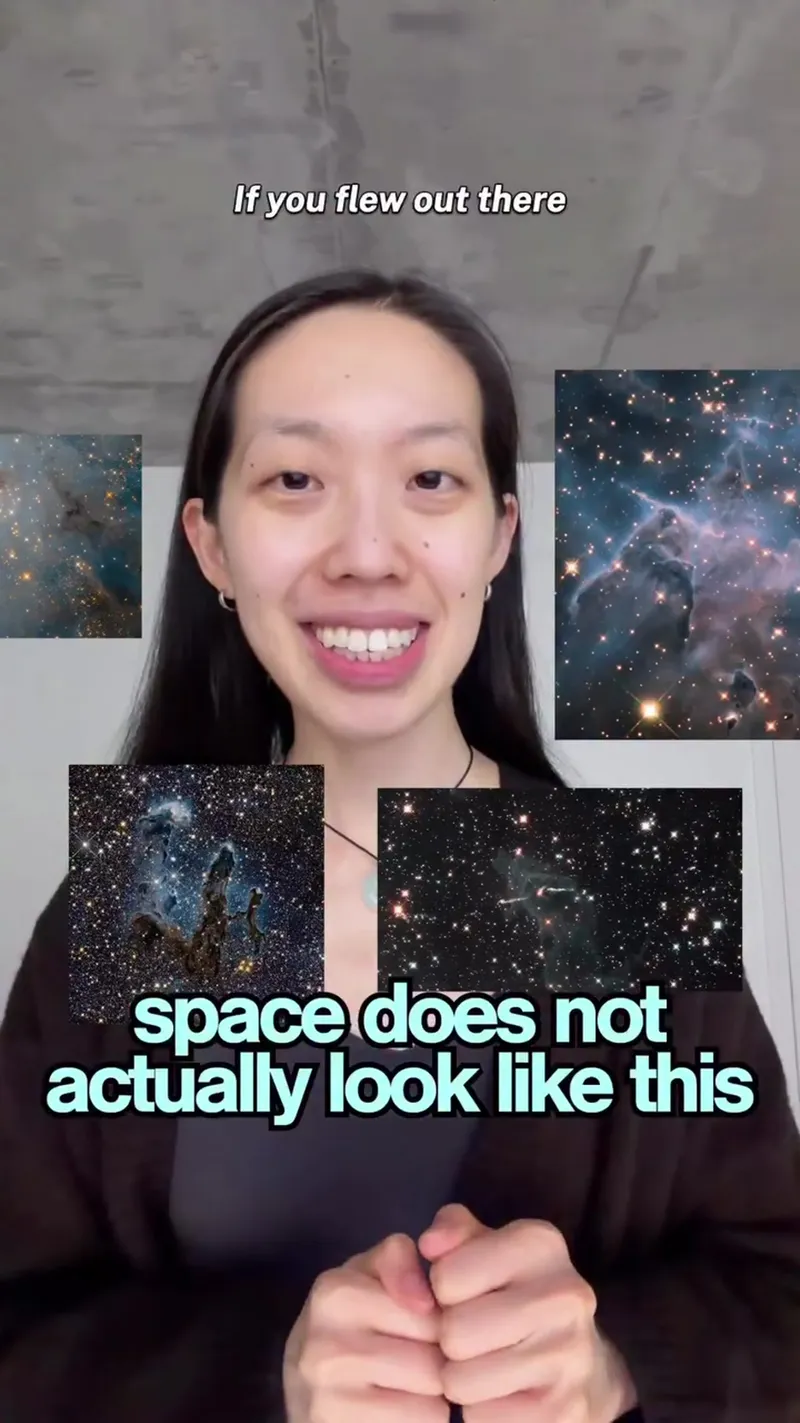
This video explains that famous images of the universe are actually data visualizations rather than traditional photographs. It describes how telescopes capture light outside the human visible spectrum and how scientists map that data to specific colors to reveal hidden details of cosmic structures.
Why Space Doesn't Actually Look Like NASA's Photos
This video explains that famous images of the universe are actually data visualizations rather than traditional photographs. It describes how telescopes capture light outside the human visible spectrum and how scientists map that data to specific colors to reveal hidden details of cosmic structures.
- Views
- 3.4M
- Likes
- 264.3K
- Comments
- 1.7K
- Topics
Analysis
Space doesn't actually look like this. If you flew out there and looked out the window, you wouldn't see this.
Space doesn't actually look like this. If you flew out there and looked out the window, you wouldn't see this. Our eyes catch only a thin sliver of light, what's known as visible light. And only when it's bright enough, the telescopes can pick up wavelengths we can, like infrared and ultraviolet. So how does that capture data then become an image like this? This is the pillars of creation. The Webb telescope captures infrared light, which is invisible to us. So this image is made by mapping the shortest captured wavelength to purple and the longest to red, with the rest in between. Hubble's version works, captures visible light. But two of the key elements scientists want to study, sulfur and hydrogen, sit at almost the same wavelength, so they both look like nearly the same red to us. To tell them apart, astronomers map one to red and one to green so you can actually see each element in the nebula. So astronomical images aren't really photographs. They're more like data visualizations, where each pixel represents a telescope measurement. And the color is a choice, a way to make those measurements mean something, such as revealing the light we can't see or separating light we can't tell apart. To help us better understand the universe,
- 01The Counter-Intuitive Hook
Challenge the viewer's visual reality immediately.
- 02The Sensory Limitation
Explain the biological or technical reason why we don't see the full truth.
- 03The Central Question
Bridge the gap between the hidden data and the final result.
- 04Technical Example A
Explain the mapping process of one specific tool or method.
- 05The Comparison/Problem
Introduce a different method and the specific problem it faces.
- 06The Expert Solution
Show how experts manipulate the data to create clarity.
- 07The Conceptual Shift
Provide a new definition for what the viewer is seeing.
- 08The Purposeful Payoff
Summarize the 'Why' behind the process and its benefit to the world.