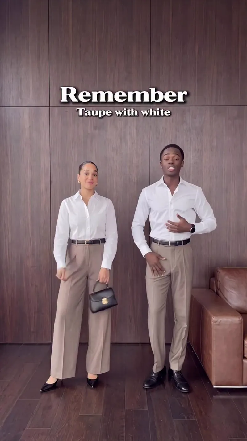
This video showcases specific color pairings designed to create an expensive and sophisticated office aesthetic. It compares standard clothing combinations with more intentional alternatives to help viewers project confidence and 'quiet wealth' through their professional wardrobe.
Color Combinations to Look Expensive at the Office
This video showcases specific color pairings designed to create an expensive and sophisticated office aesthetic. It compares standard clothing combinations with more intentional alternatives to help viewers project confidence and 'quiet wealth' through their professional wardrobe.
- Views
- 4.1M
- Likes
- -1
- Topics
Analysis
Remember. Taupe with white looks grounded, but taupe with baby blue is mature calmness.
Remember. Taupe with white looks grounded, but taupe with baby blue is mature calmness. Payne's Gray with black looks composed, but Payne's Gray with soft yellow is calm contrast. Ecru with brown looks understated, but ecru with rust is warm refinement. Cocoa brown with black looks normal, but Coco brown with deep teal is quiet wealth and and cool. Taupe with white looks clean but cool. Taupe with butter yellow is soft precision.
- 01The Opening Comparison
Establish the pattern by comparing a standard pairing to an elevated one using a direct 'but' transition.
- 02The Mood Contrast
Provide a second comparison focusing on the emotional atmosphere of the choice.
- 03The Refined Contrast
Offer a third comparison that focuses on the sophistication or 'temperature' of the result.
- 04The Status Comparison
Present a fourth comparison that labels a specific pairing with a high-status or 'lifestyle' descriptor.
- 05The Final Precision Re-hook
Return to the first element mentioned but offer a different, highly specific alternative to show depth of knowledge.