Have you noticed how many people treat their personal brands the way corporations do? Aren't they the same? They share similar principles, but they're not the same. Here are several reasons on why they're different. Corporate brands play it safe—they don't want to alienate audiences. After all, one bad decision could cost millions or even hundreds of millions of dollars in lost revenue. Corporate brands are often bland, soulless and impersonal. So, is this a model you want to follow in building your personal brand? Whereas vulnerability is a liability in corporate brands, vulnerability is an asset with personal brands. People don't want cookie-cutter, glossy perfection. They want unvarnished, unrehearsed, real and relatable. As Kendrick Lamar raps "… I'm so f*in' sick and tired of the Photoshop Show me somethin' natural like afro on Richard Pryor Show me somethin' natural like ass with some stretch marks" What do you think? Much ado about nothing? Do you see the clear difference? #contentmarketing #brandstrategist #socialmediastrategy #brandmarketing #onlinepresence #digitalbranding #brandingtips #personalbranding #personalbrand #brandlab #brandstrategy
Have you noticed how many people treat their personal brands the way corporations do?
This text-led carousel compares corporate and personal brands across several dimensions, including voice, audience, point of view, messaging, identity, and vulnerability. Each middle slide presents a corporate approach against a contrasting personal-brand approach, ending with a question and engagement prompt.
- Likes
- 11.7K
- Comments
- 375
- Slides
- 10
- Topics
Analysis
This text-led carousel compares corporate and personal brands across several dimensions, including voice, audience, point of view, messaging, identity, and vulnerability. Each middle slide presents a corporate approach against a contrasting personal-brand approach, ending with a question and engagement prompt.
Sign in to see the full analysis.
Sign inSlide 1
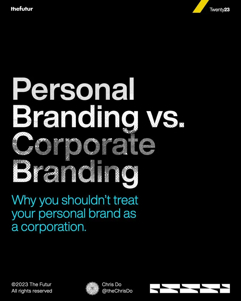
thefutur Twenty23 Personal Branding vs. Corporate Branding Why you shouldn’t treat your personal brand as a corporation. ©2023 The Futur All rights reserved Chris Do @theChrisDo
The oversized comparison is easy to scan and stops the scroll through scale and contrast. The subtitle creates a clear warning for anyone building a personal brand. It promises several reasons, so viewers swipe to discover the first one and test whether their current approach is flawed.
The slide establishes that two related ideas are different, but hides the specific differences and the cost of confusing them. The viewer swipes to learn why the familiar approach may be wrong and what approach to use instead.
The huge stacked headline: “Personal Branding vs. Corporate Branding”
Black creates a serious, premium mood. White headline text creates strong contrast, while cyan highlights the practical warning. Yellow branding adds a small burst of energy and recognition.
Blue subtitle: “Why you shouldn’t treat your personal brand as a corporation.” Small The Futur and Twenty23 branding at the top Creator and copyright details at the bottom White geometric pattern in the lower-right corner
The core driver is a strong contrast paired with a personal relevance test: creators are asked whether they are treating themselves like a corporation. Each swipe promises another practical difference, while the final point about vulnerability delivers the strongest emotional argument for being more authentic.
Slide 1
Contrast Warningthefutur Twenty23 Personal Branding vs. Corporate Branding Why you shouldn’t treat your personal brand as a corporation. ©2023 The Futur All rights reserved Chris Do @theChrisDo
Slide 2
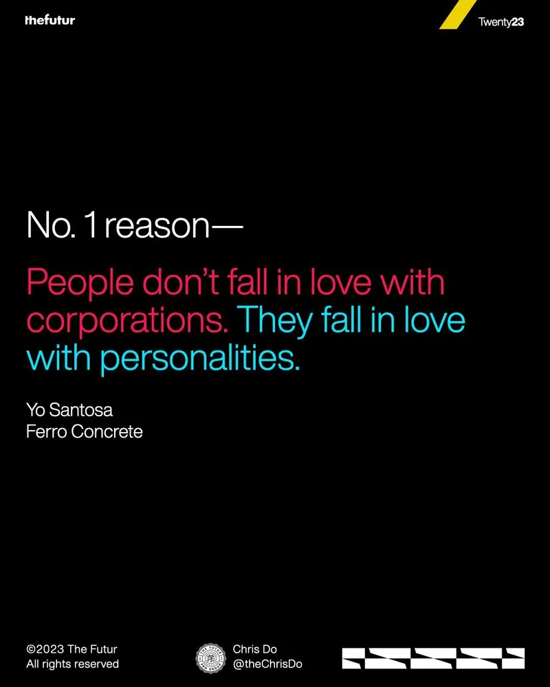
Emotional Contrastthefutur Twenty23 No. 1 reason— People don’t fall in love with corporations. They fall in love with personalities. Yo Santosa Ferro Concrete ©2023 The Futur All rights reserved Chris Do @theChrisDo
- 01The Contrast Warning
Open with two related approaches that people confuse. Warn the viewer against using the wrong model and promise several reasons why.
- 02The Human Connection Reason
Give the first and most emotionally clear reason. Contrast what people do not emotionally connect with against what they naturally connect with.
- 03The Identity Contrast
Define the basic difference between the two approaches. Show that one represents a group or system, while the other centers on an individual or distinct point of view.
- 04The Voice Contrast
Compare how each approach sounds. Show that the conventional model aims for broad acceptability, while the human-centered model gains strength from a distinct and relatable voice.
- 05The Risk Reversal
Flip the usual idea of risk. Explain that the impersonal approach fears strong opinions, while the human-centered approach is weakened by avoiding a clear position.
- 06The Audience Contrast
Show that broad reach is not always the goal. Contrast large-scale targeting with focused relevance for specific people or communities.
- 07The Message Contrast
Move from who the approach serves to what it says. Contrast promotion-led communication with stories, experiences, and direct interaction.
- 08The Recognition Contrast
Expand the meaning of identity. Show that one approach relies on formal identifiers, while the other can be recognized through many human signals and repeated personal choices.
- 09The Vulnerability Reversal
Deliver the strongest emotional proof. Reframe a trait that can damage the impersonal model as a strength that creates trust, relatability, and room to grow in the human-centered model.
- 10The Reflection CTA
Turn the argument into a personal self-check. Ask the viewer whether they are using the wrong model, then invite a response and a simple engagement action.
Slide 1
thefutur Twenty23 Personal Branding vs. Corporate Branding Why you shouldn’t treat your personal brand as a corporation. ©2023 The Futur All rights reserved Chris Do @theChrisDo
The oversized comparison is easy to scan and stops the scroll through scale and contrast. The subtitle creates a clear warning for anyone building a personal brand. It promises several reasons, so viewers swipe to discover the first one and test whether their current approach is flawed.
The slide establishes that two related ideas are different, but hides the specific differences and the cost of confusing them. The viewer swipes to learn why the familiar approach may be wrong and what approach to use instead.
The huge stacked headline: “Personal Branding vs. Corporate Branding”
Black creates a serious, premium mood. White headline text creates strong contrast, while cyan highlights the practical warning. Yellow branding adds a small burst of energy and recognition.
Blue subtitle: “Why you shouldn’t treat your personal brand as a corporation.” Small The Futur and Twenty23 branding at the top Creator and copyright details at the bottom White geometric pattern in the lower-right corner
Slide 2
thefutur Twenty23 No. 1 reason— People don’t fall in love with corporations. They fall in love with personalities. Yo Santosa Ferro Concrete ©2023 The Futur All rights reserved Chris Do @theChrisDo
“No. 1 reason” signals an organized series and makes the statement feel important. The repeated “fall in love” wording creates a memorable emotional contrast, while the color change guides the eye from the problem to the solution. The promised list keeps the sequence moving.
The slide gives the first answer to the comparison, but leaves the remaining reasons and practical implications hidden. It makes the viewer question whether their work feels impersonal, forcing a swipe to see the next reason and how to become more relatable.
The contrasting statement: “People don’t fall in love with corporations. They fall in love with personalities.”
Black keeps the slide bold and editorial. Pink marks the less appealing option, while cyan marks the emotionally desirable option. The color split makes the contrast readable before the viewer processes every word.
“No. 1 reason—” frames the statement as the first point Pink text emphasizes the corporate side of the contrast Cyan text emphasizes the personality side Attribution to Yo Santosa and Ferro Concrete Repeated brand marks and footer details
Slide 3 · Identity Comparison
Defines the core difference between collective corporate identity and individual personal identity.
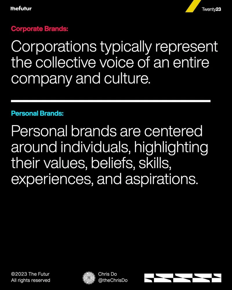
thefutur Twenty23 Corporate Brands: Corporations typically represent the collective voice of an entire company and culture. Personal Brands: Personal brands are centered around individuals, highlighting their values, beliefs, skills, experiences, and aspirations. ©2023 The Futur All rights reserved Chris Do @theChrisDo
It suggests that identity is only the first difference, inviting the viewer to compare how each brand communicates next.
Yes. It begins delivering the promised reasons personal brands should not be treated like corporate brands.
Black text-first comparison slide. Pink and cyan labels separate corporate and personal brands, with a white divider between the two definitions.
Slide 4 · Tone Comparison
Shows that brand voice should become more personal and relatable when the brand is built around an individual.
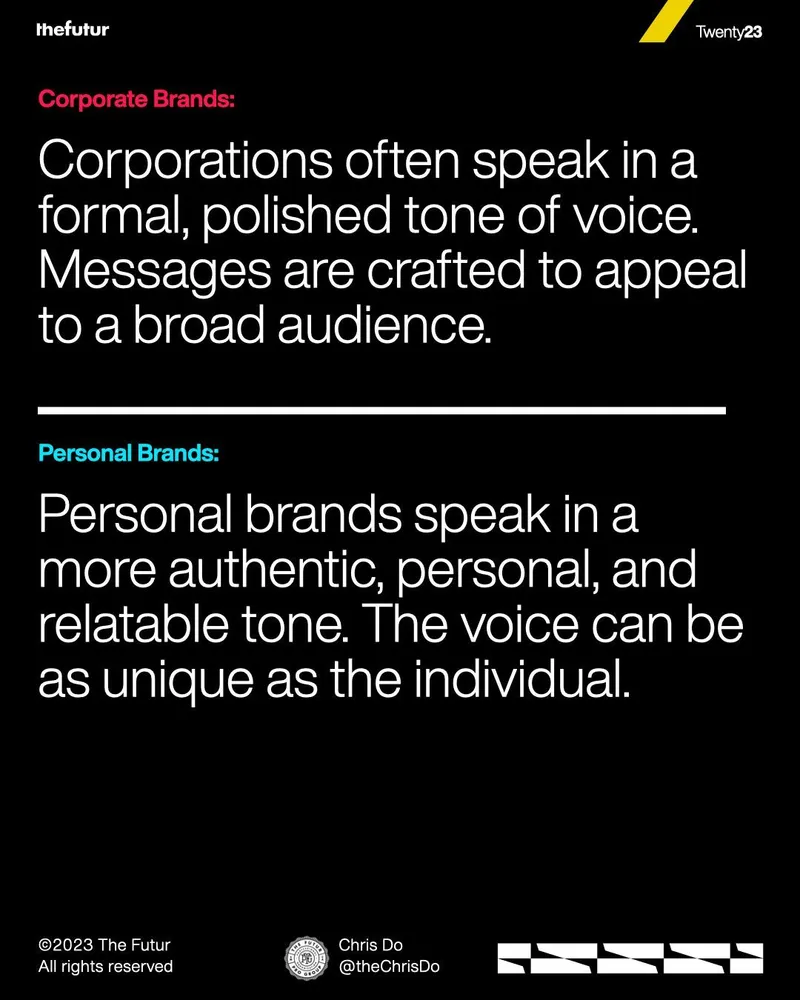
thefutur Twenty23 Corporate Brands: Corporations often speak in a formal, polished tone of voice. Messages are crafted to appeal to a broad audience. Personal Brands: Personal brands speak in a more authentic, personal, and relatable tone. The voice can be as unique as the individual. ©2023 The Futur All rights reserved Chris Do @theChrisDo
It raises the question of whether a personal brand should take a stronger position instead of trying to sound broadly acceptable.
Yes. It fulfills the hook’s promise by giving another practical difference between corporate and personal branding.
Black comparison slide with large white type. It contrasts a formal, broad corporate voice with a more personal and unique voice.
Slide 5 · Point-of-View Contrast
Reverses the risk calculation, arguing that personal brands lose strength when they avoid clear opinions.
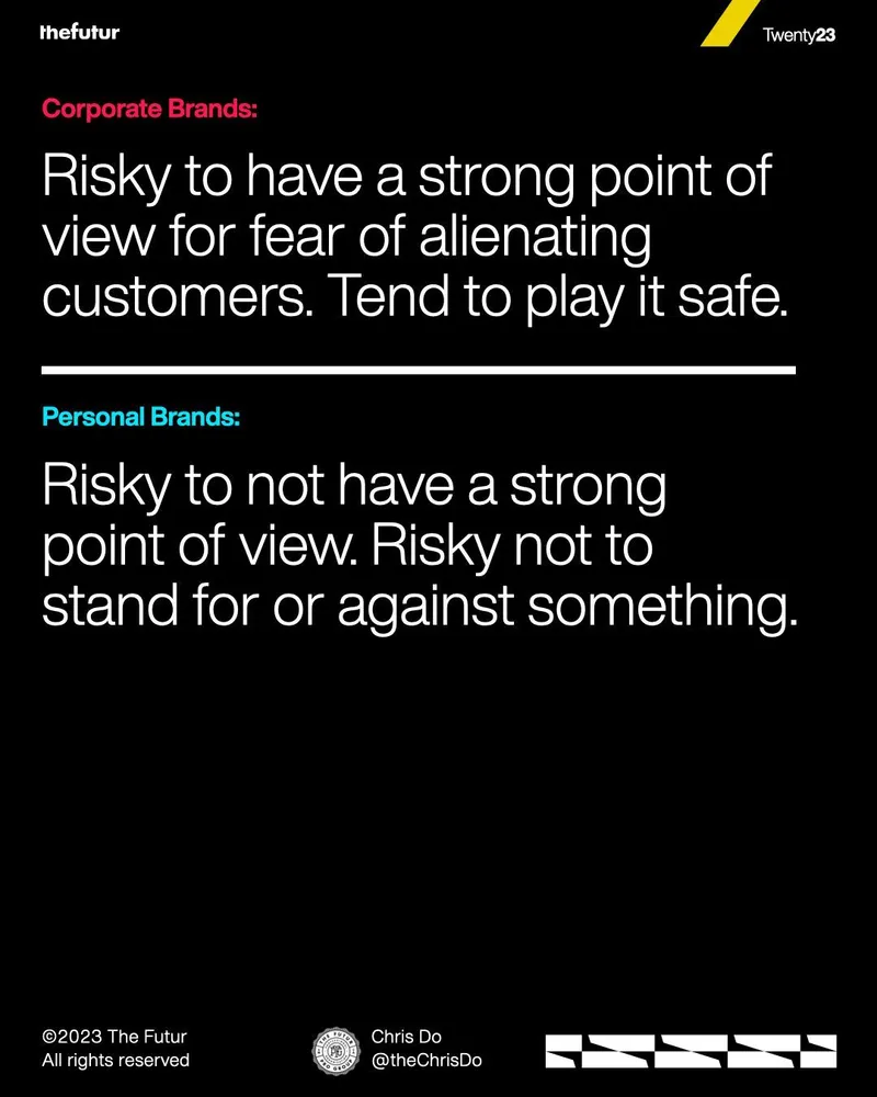
thefutur Twenty23 Corporate Brands: Risky to have a strong point of view for fear of alienating customers. Tend to play it safe. Personal Brands: Risky to not have a strong point of view. Risky not to stand for or against something. ©2023 The Futur All rights reserved Chris Do @theChrisDo
It implies that personal brands should focus on a specific audience rather than trying to appeal to everyone.
Yes. It adds another reason not to copy corporate behavior: playing safe can weaken a personal brand.
The comparison layout frames caution as a corporate priority and a strong point of view as a personal-brand requirement.
Slide 6 · Audience Comparison
Explains that personal brands can build relevance through focused communities instead of broad market reach.
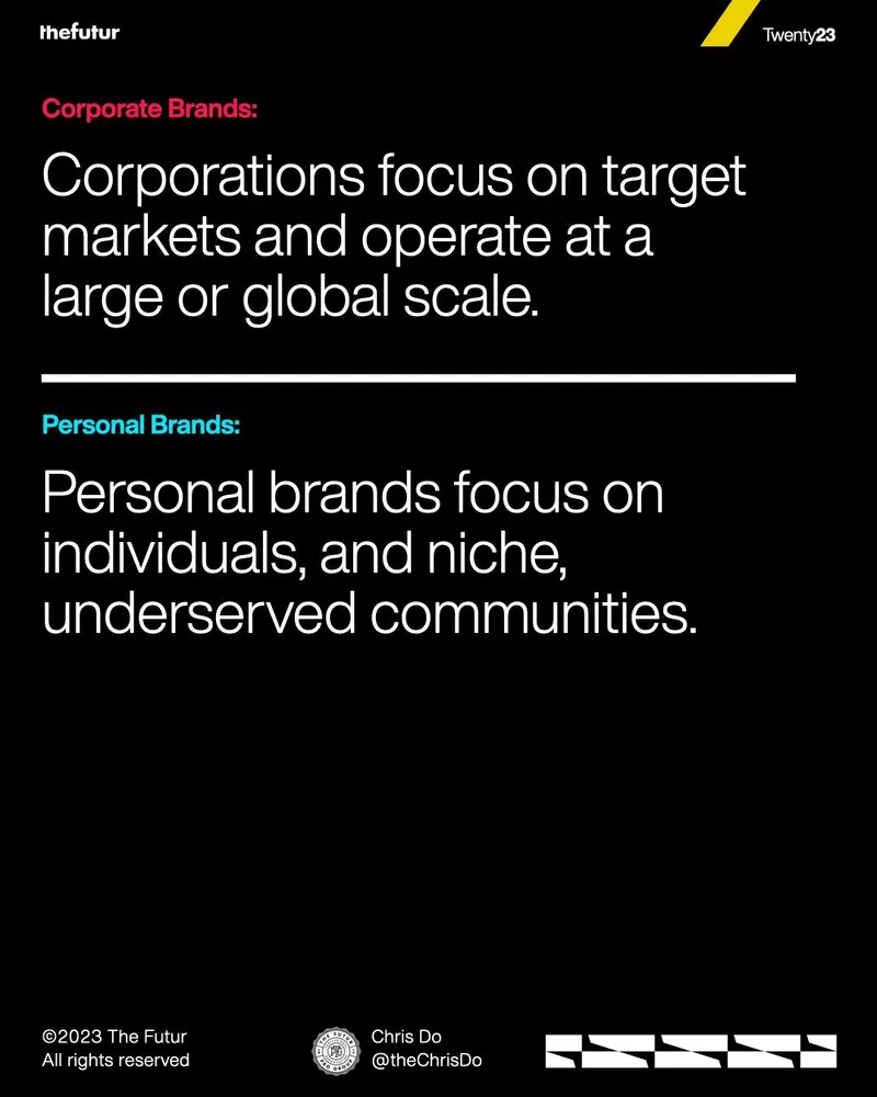
thefutur Twenty23 Corporate Brands: Corporations focus on target markets and operate at a large or global scale. Personal Brands: Personal brands focus on individuals, and niche, underserved communities. ©2023 The Futur All rights reserved Chris Do @theChrisDo
It sets up a further distinction in how each brand communicates with its audience.
Yes. It fulfills another promised difference by comparing the audiences each brand type serves.
A two-part comparison contrasts large-scale target markets with individuals and niche, underserved communities.
Slide 7 · Messaging Comparison
Moves from audience size to message substance, showing why personal stories make communication feel more direct.
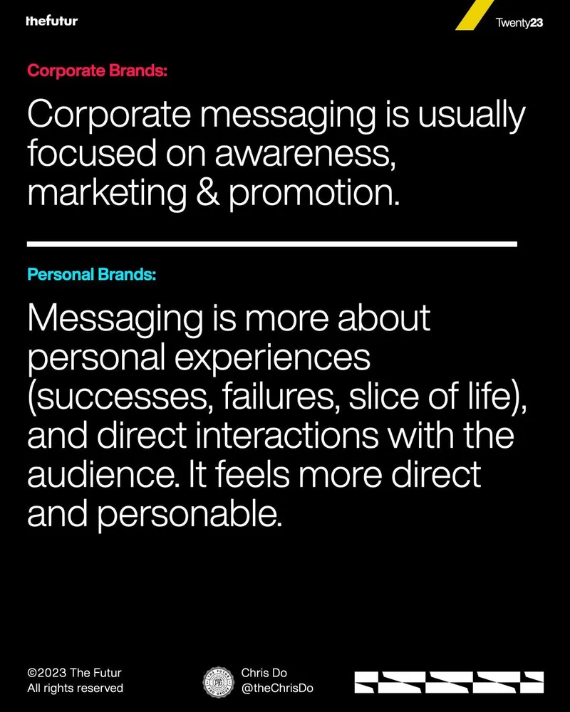
thefutur Twenty23 Corporate Brands: Corporate messaging is usually focused on awareness, marketing & promotion. Personal Brands: Messaging is more about personal experiences (successes, failures, slice of life), and direct interactions with the audience. It feels more direct and personable. ©2023 The Futur All rights reserved Chris Do @theChrisDo
It opens the question of how personal identity is expressed visually, beyond words and messaging.
Yes. It delivers another practical difference and reinforces the hook’s promise of greater human connection.
The slide contrasts promotional corporate messaging with personal stories and direct audience interaction.
Slide 8 · Identity System Comparison
Broadens the idea of brand identity, showing that personal recognition can come from many human signals.
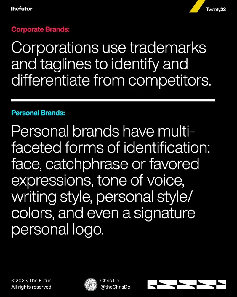
thefutur Twenty23 Corporate Brands: Corporations use trademarks and taglines to identify and differentiate from competitors. Personal Brands: Personal brands have multi-faceted forms of identification: face, catchphrase or favored expressions, tone of voice, writing style, personal style/colors, and even a signature personal logo. ©2023 The Futur All rights reserved Chris Do @theChrisDo
It prepares the strongest emotional contrast by asking what personal brands can reveal that corporations usually cannot.
Yes. It fulfills the visual identity part of the carousel’s comparison promise.
The slide compares fixed corporate identifiers with the many recognizable traits that can make an individual distinct.
Slide 9 · Emotional Payoff
Delivers the carousel’s strongest argument: authenticity and vulnerability create connection in a personal brand.
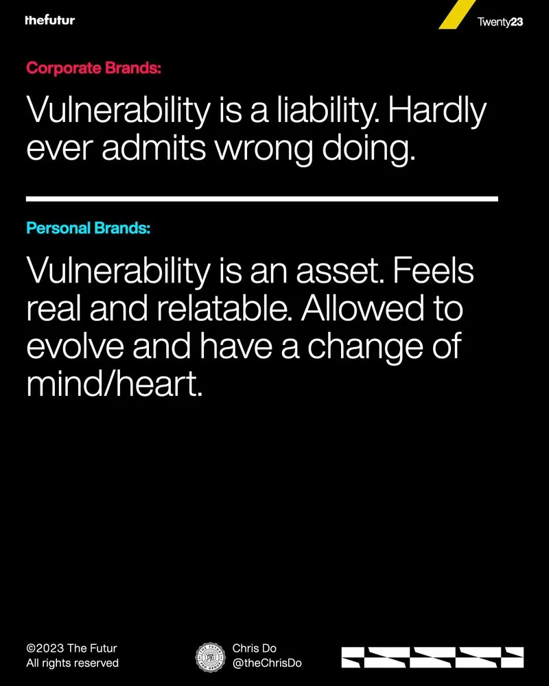
thefutur Twenty23 Corporate Brands: Vulnerability is a liability. Hardly ever admits wrong doing. Personal Brands: Vulnerability is an asset. Feels real and relatable. Allowed to evolve and have a change of mind/heart. ©2023 The Futur All rights reserved Chris Do @theChrisDo
It leads directly to a self-check: whether the viewer is treating their own personal brand like a corporation.
Yes. It fulfills the central emotional promise from the hook and caption by showing why personal brands should feel real rather than polished and impersonal.
The final comparison slide presents vulnerability as a corporate weakness but a personal-brand strength that supports change and relatability.
Slide 10 · Reflection and CTA
Closes the argument with a personal-brand self-check, then asks viewers to respond and share the content.
thefutur Twenty23 © Do you agree? Are you treating your personal brand as a corporate brand? Let me know what you think. Like and share for more content like this. Helping left-brainers, think right™ ©2023 The Futur All rights reserved Chris Do @theChrisDo
Let me know what you think. Like and share for more content like this.
It invites an ongoing conversation and promises more related content for people who like and share.
Yes. It resolves the opening warning by directly asking whether the viewer has made the mistake described in the hook.
A black closing slide asks viewers to reflect on their branding approach and includes a yellow abstract graphic plus engagement prompts.