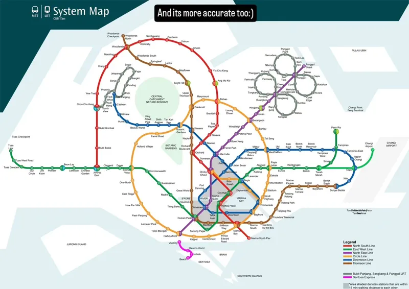
I designed this 7 years ago, a new map for Singapore's metro system or the MRT. it wasn't just a fancy new design, it was meant to be geographically more accurate with stations placed closer to where they are in real life, acknowledging major features like the giant rainforest in the middle of singapore as well as the actual island's shape. accuracy aside, i also wanted the map to have a personality, with each line having it's own identity with sexy curves and together, form a composition that is playful and memorable, like an elephant, with the central nature reserve being its eye. 7 years on, I still have this map saved on my phone and I use it every time I want to navigate singapore. It's not official and is just my own little thing, but to me, it just makes the way finding less stressful and more fun, hope you'd enjoy it too!
I designed this 7 years ago, a new map for Singapore's metro system or the MRT.
This two-slide carousel introduces a personal redesign of Singapore’s MRT map. It moves from the original map and the creator’s dissatisfaction to a more geographically accurate version that gives each rail line a distinct visual identity.
- Likes
- 50.3K
- Comments
- 327
- Slides
- 2
- Topics
Analysis
This two-slide carousel introduces a personal redesign of Singapore’s MRT map. It moves from the original map and the creator’s dissatisfaction to a more geographically accurate version that gives each rail line a distinct visual identity.
Sign in to see the full analysis.
Sign inSlide 1
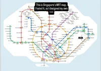
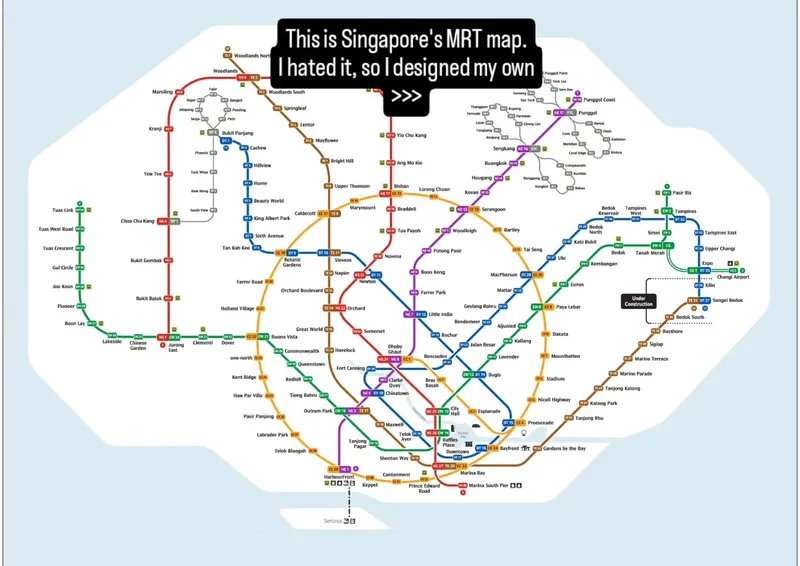
This is Singapore's MRT map. I hated it, so I designed my own >>>. Under Construction. Major station and line labels are also shown throughout the map.
The oversized black text is the first stop point. “I hated it” creates conflict around something familiar, while “designed my own” signals a reveal. The crowded map supports credibility but withholds the new version, creating a clear reason to swipe.
The slide establishes that the creator rejected a familiar system, but hides what the replacement looks like and why it is better. The viewer swipes to see the alternative and judge whether the redesign solves the problem.
Black speech-bubble headline: “This is Singapore's MRT map. I hated it, so I designed my own >>>”
The black headline box creates strong contrast and urgency against the pale blue and white map. Bright route colors make the map feel complex but energetic, while the cool background keeps it clean.
Large, detailed Singapore MRT map fills most of the slide. Colored transit lines create a dense, highly structured visual. Pale blue background frames the white map area. Many station names and route labels provide proof and detail.
The carousel builds a simple promise: the creator disliked the existing MRT map and made a better one. Viewers swipe to see whether the redesign is actually more accurate and how it changes the map’s personality.
Slide 1
Controversial ReframeThis is Singapore's MRT map. I hated it, so I designed my own >>>. Under Construction. Major station and line labels are also shown throughout the map.
Slide 2
Proof RevealSystem Map. Cliff Tan. And its more accurate too:). CENTRAL CATCHMENT NATURE RESERVE. BOTANIC GARDENS. S’PORE RIVER. MARINA BAY. Legend: North South Line, East West Line, North East Line, Circle Line, Downtown Line, Thomson Line, Bukit Panjang, Sengkang & Punggol LRT, Sentosa Express. Area shaded denotes stations that are within 15 min walking distance.
- 01The Familiar System Hook
Start with a recognizable system, method, or design. State a strong personal objection and promise that you created a better version. Hide the alternative so the viewer must swipe.
- 02The Better Version Reveal
Reveal the creator's replacement immediately. Add one clear improvement claim, then show visual evidence through labels, a legend, comparisons, or highlighted features. Make the result feel both surprising and usable.
Slide 1
This is Singapore's MRT map. I hated it, so I designed my own >>>. Under Construction. Major station and line labels are also shown throughout the map.
The oversized black text is the first stop point. “I hated it” creates conflict around something familiar, while “designed my own” signals a reveal. The crowded map supports credibility but withholds the new version, creating a clear reason to swipe.
The slide establishes that the creator rejected a familiar system, but hides what the replacement looks like and why it is better. The viewer swipes to see the alternative and judge whether the redesign solves the problem.
Black speech-bubble headline: “This is Singapore's MRT map. I hated it, so I designed my own >>>”
The black headline box creates strong contrast and urgency against the pale blue and white map. Bright route colors make the map feel complex but energetic, while the cool background keeps it clean.
Large, detailed Singapore MRT map fills most of the slide. Colored transit lines create a dense, highly structured visual. Pale blue background frames the white map area. Many station names and route labels provide proof and detail.
Slide 2
System Map. Cliff Tan. And its more accurate too:). CENTRAL CATCHMENT NATURE RESERVE. BOTANIC GARDENS. S’PORE RIVER. MARINA BAY. Legend: North South Line, East West Line, North East Line, Circle Line, Downtown Line, Thomson Line, Bukit Panjang, Sengkang & Punggol LRT, Sentosa Express. Area shaded denotes stations that are within 15 min walking distance.
This slide pays off the first slide’s reveal instead of repeating it. The redesigned map looks more geographic and intentional, while the short headline adds proof. The unusual overall shape and highlighted landmarks create fresh curiosity about the design decisions behind it.
The first slide promises a personal replacement; this slide reveals it and adds a second benefit: greater accuracy. The remaining gap is how the redesign works and what makes it meaningfully better, encouraging viewers to keep swiping for the explanation.
The redesigned MRT map, especially its elephant-like overall shape and green central nature reserve.
Dark teal framing gives the slide a polished, official feel. White space makes the map easier to inspect, while bright route colors separate systems and draw the eye across the composition. Green highlights nature and geographic accuracy.
Headline: “And its more accurate too:)” reinforces the redesign claim. “System Map” title and creator credit appear in the upper left. Central Catchment Nature Reserve is highlighted as a large green circle. A legend in the lower right explains the colored transit lines. Station names and geographic features show added detail.